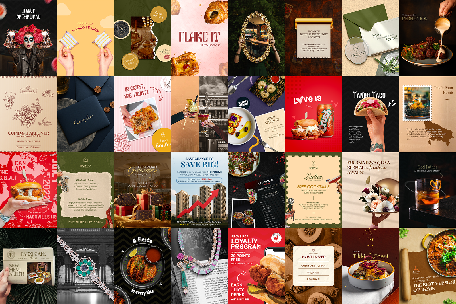
 Hero shot · the full 9-post grid view
A restaurant's feed is its front window. I design the statics, carousels and stories for F&B brands across Canada and India through The Digital Nuts, from celebrity kitchens to legacy sweet shops to fried chicken joints, each with a feed that looks like nobody else's.
Hero shot · the full 9-post grid view
Every restaurant wants the same three things from social: look premium, look appetising, look consistent. The hard part is doing that for six brands at once without any two feeds looking related.
Khazana needs celebrity-chef gravitas. Juicy Birds needs to shout. Bikanervala carries decades of nostalgia. Farzi wants theatre. Same designer, same week, six completely separate visual worlds, each held to the same standard.
The fastest way to ruin a portfolio of restaurant clients is to develop a house style and apply it everywhere. Then every feed looks like the agency, not the brand. Each account needed its own visual grammar: its own palette, type voice, photography treatment and sense of humour.
For each brand I set the rules first: how the type behaves, where the logo lives, how much breathing room a dish gets, what the feed looks like as a whole. Then I design against those rules so the account stays recognisable but never repetitive. A dish post, an offer post and a festival post should feel like the same restaurant on three different days, not the same template with the words swapped.
Grouped by brand, because the range is the point.
If the image doesn't make you want to eat, nothing else on the post matters. The dish gets the space, the light and the crop it deserves before a single word goes on.
A post has one job: a dish, an offer, a story. The moment it tries to do three, it does none. Everything that doesn't serve that one idea comes off.
Every creative is designed twice: once as a square someone sees in the feed, and once as a tile in the profile grid. Both views have to work.
The work itself, by the numbers.