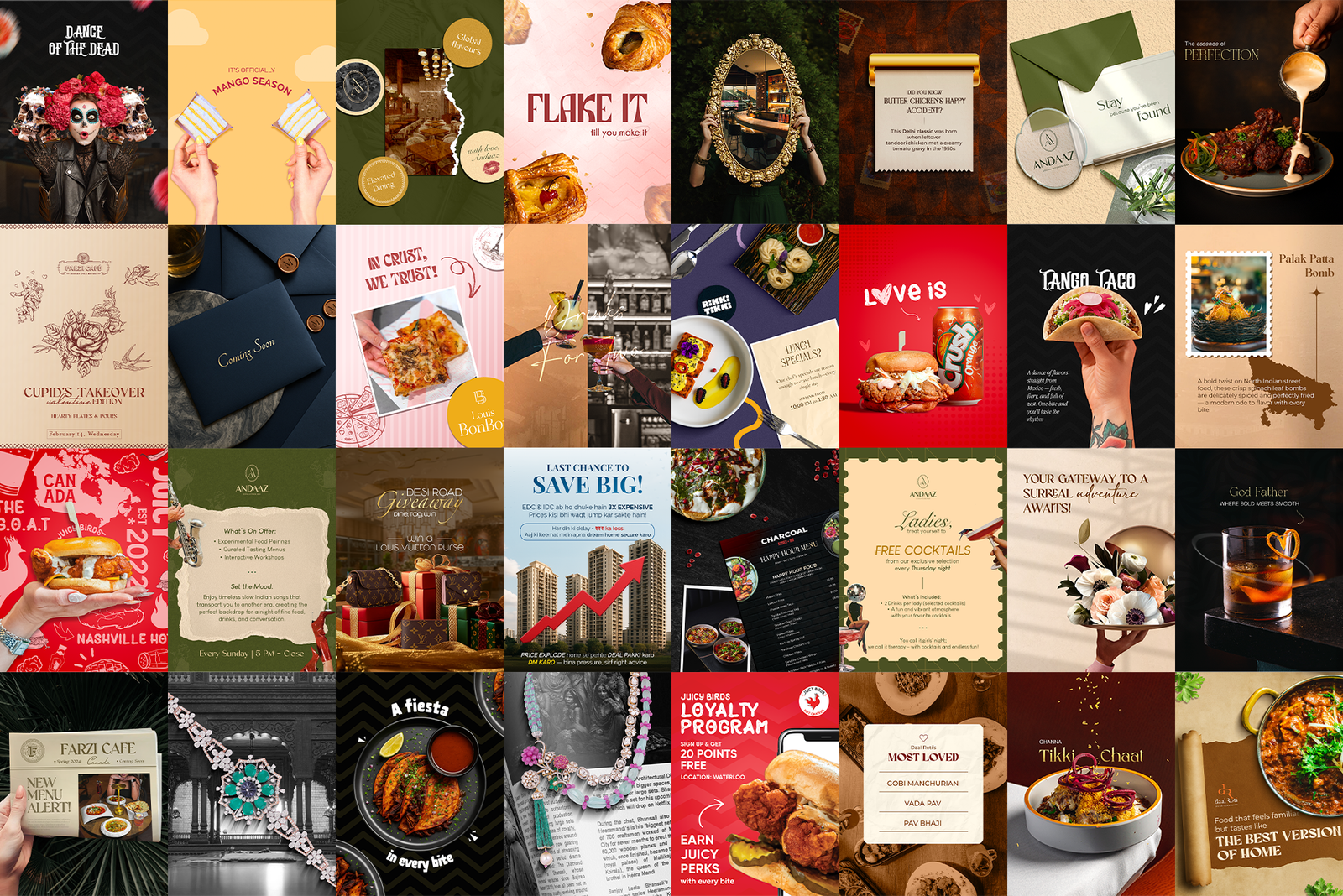
 Hero shot · the full 9-post grid view
A static post asks for attention. A reel takes it. I design the motion graphics, animated menu drops and festive campaign films for F&B brands across Canada and India, built for a feed where the sound is off and the scroll is fast.
Hero shot · the full 9-post grid view
Reels are where food brands win or disappear. The platform rewards them, the audience expects them, and most restaurants still post a static photo with a caption and hope.
My job is the motion layer of every account: new dish drops, festive campaigns, offer announcements and atmosphere films, all cut for a viewer who is standing in a queue, holding the phone in one hand, with the sound off.
Most food reels lose the viewer before the dish even lands on screen. There is no time for a slow build, a logo sting, or a title card nobody asked for. And every brand needs its motion to feel like an extension of its feed, not a stock template with a different logo dropped on the end.
Frame one is the hook: the pour, the pull, the cheese stretch, the flame. Type arrives after the appetite does, never before. I keep cuts fast, text short enough to read at a glance, and every animation locked to the brand's existing palette and typeface, so a reel and a static post from the same account look like they were made on the same day by the same person. Because they were.
Grouped by brand. Tap any frame to play.
The food moves before anything else does. No logo stings, no slow fades, no build-up. If the first second doesn't earn the second second, nothing after it matters.
Most people watch with the sound off. Every reel has to make complete sense as pure picture and type, so the music is a bonus rather than a requirement.
The palette, typeface and pacing come straight from the brand's static work. A reel should look like the feed learned to move, not like it was outsourced.
The work itself, by the numbers.