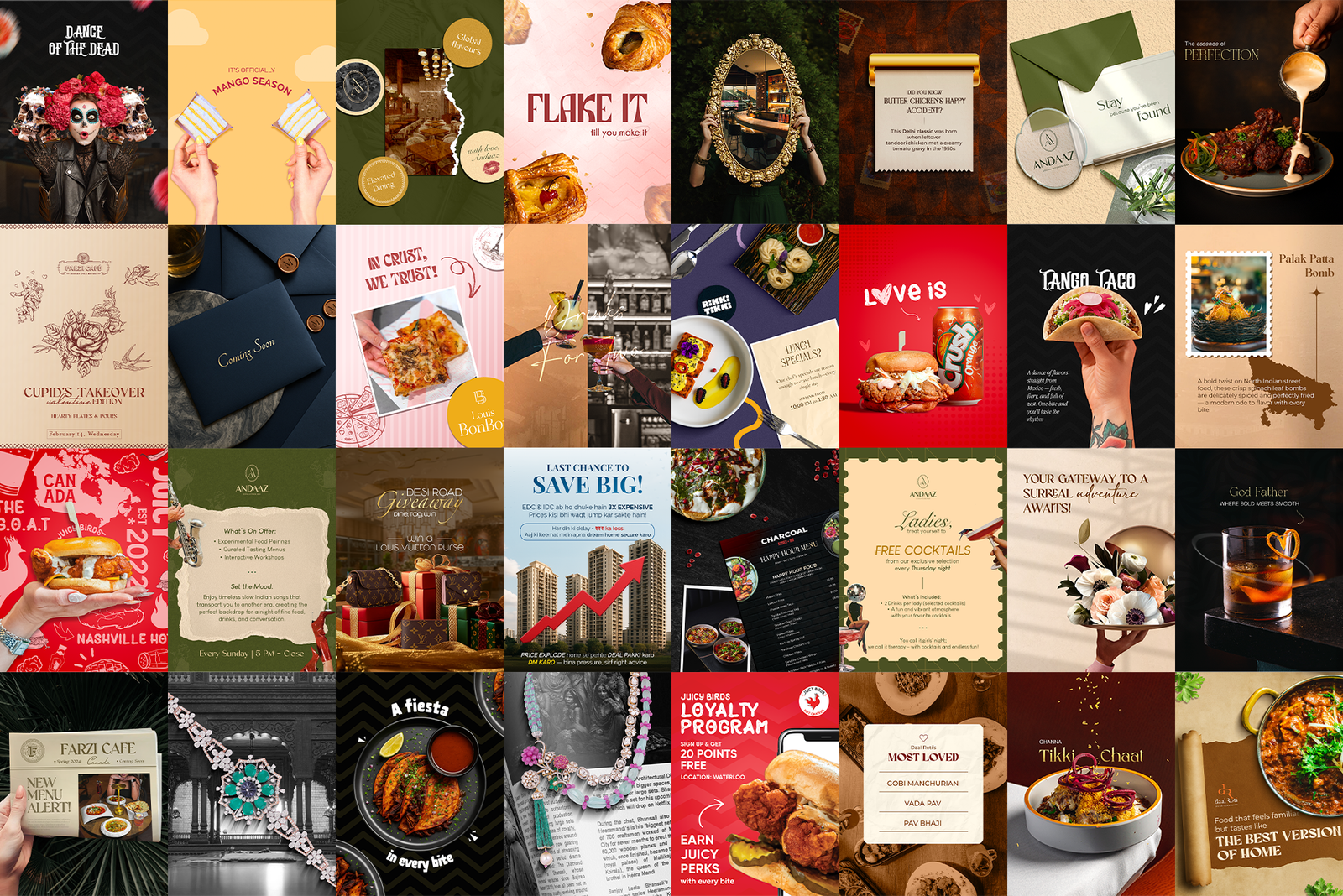
 Hero shot · the full 9-post grid view
Andaaz, a social kitchen and bar in Mississauga, needed an Instagram presence before it had a single dish to photograph. I designed the pre-launch hype grids that turned architectural renders and pure vibe into a feed people wanted a table at.
Hero shot · the full 9-post grid view
Andaaz had everything a restaurant launch needs except the restaurant. The space was still being built, the menu wasn't shot, and the brand existed only as a logo and a set of interior renders.
The job: make Mississauga hungry for a place they couldn't visit yet. That meant designing a feed that sold atmosphere instead of food, built anticipation instead of orders, and made every square feel like a secret worth following.
A restaurant feed usually leans on its greatest asset: the plate. Andaaz didn't have one yet. All I had were 3D renders of an unfinished space and a brand palette. The grid had to do what a menu normally does: make people imagine themselves inside.
I designed the feed as full 9-post grids, composed as one image and experienced as a story. Interior renders sat beside custom illustrations, vintage-editorial vibe shots and teaser copy, all locked to the brand's olive, cream and maroon palette. Sunset motifs, moon phases, keyholes and drawn characters gave the brand a personality before the first guest walked in. Line by line, the grid whispered what Andaaz would feel like: "Sip to see the sunrise." "Stay, because you've been found." "Pick your poison."
A look at the pieces that make up the system.
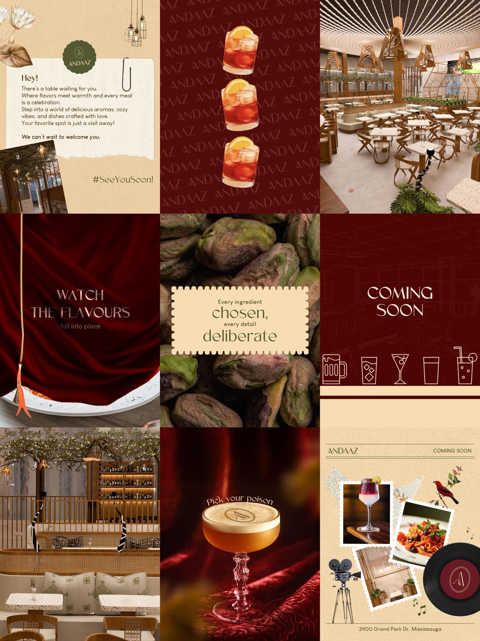 Grid 01 · illustration-led, the brand world
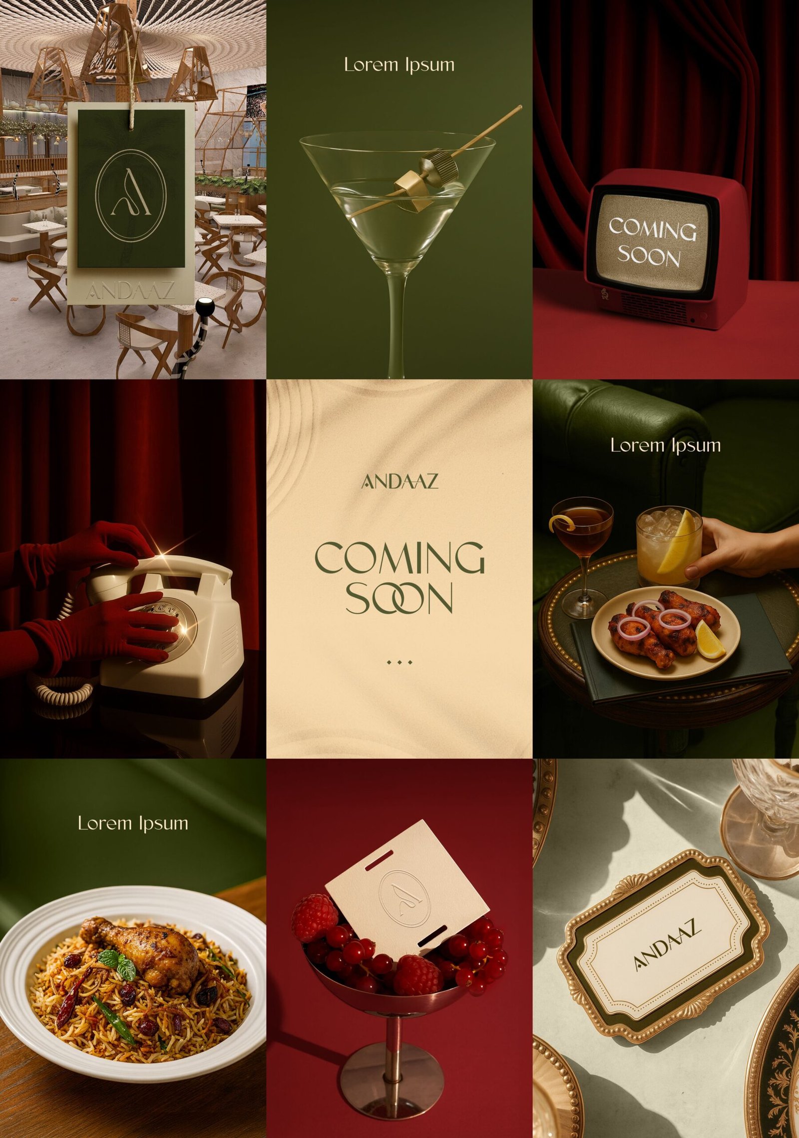 Grid 02 · renders meet teaser copy
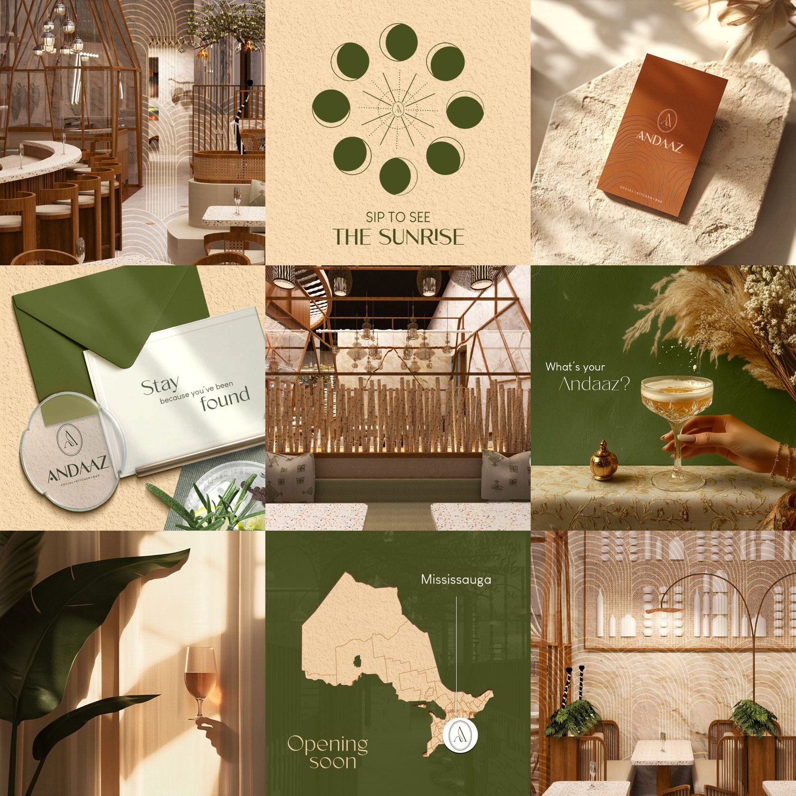 Grid 03 · maroon drama, countdown phase
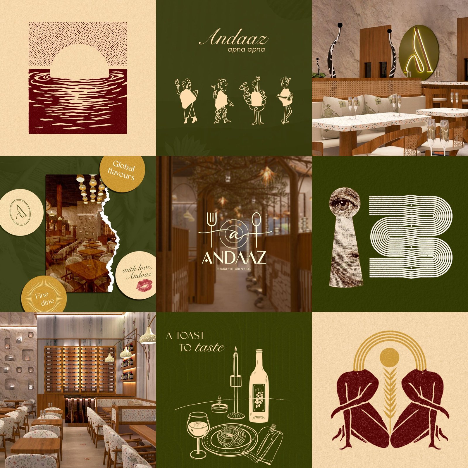 Grid 04 · concept direction
Every post was designed as one-ninth of a bigger picture. The profile view is the real canvas; individual posts are just how it travels.
Olive green, warm cream and deep maroon on every tile. Whatever the content, the feed always reads as one place, one mood, one Andaaz.
Copy stayed short and suggestive. The grid asked questions and dropped hints, because a launch campaign's job is to start a countdown in someone's head.
(Fill with real numbers from the account if you have them; safe fallbacks below:)