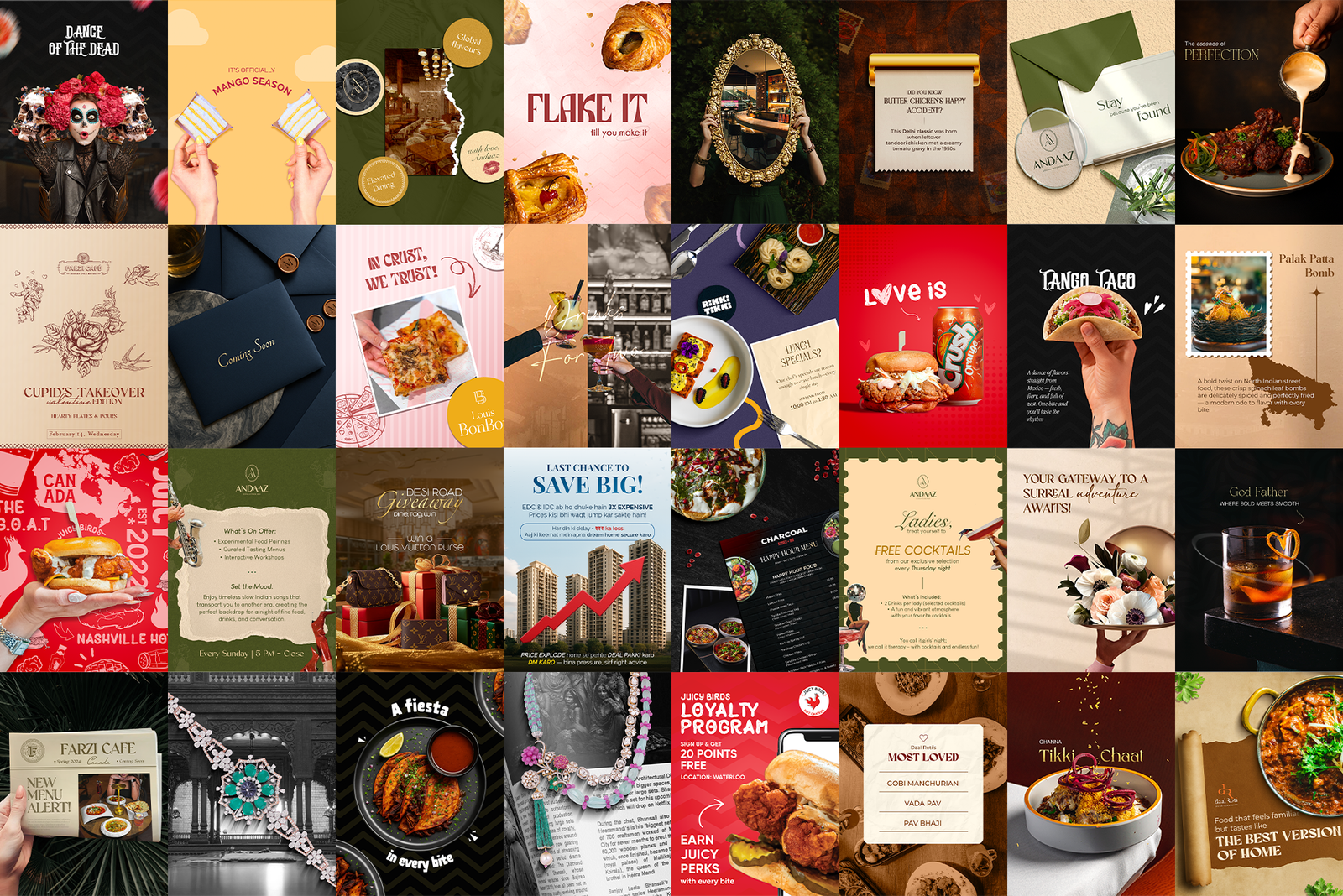
 Hero shot · the full 9-post grid view
A menu is the hardest-working thing a restaurant prints. I design seasonal and permanent menus for F&B brands across Canada and India: laid out to be read quickly, navigated easily, and to guide people toward the dishes the kitchen is proudest of.
Hero shot · the full 9-post grid view
A guest might see three of a restaurant's Instagram posts. Every guest, without exception, reads the menu. It is the one design piece with a guaranteed audience and a guaranteed effect on the bill.
Most restaurant menus are treated as a typing job: a list of dishes and prices, set in whatever font the last person used. I treat them as information design with an appetite: structure first, hierarchy second, decoration last.
Menu design is a compression problem. Long lists, small pages, dim dining rooms, allergen notes, price changes, and a guest who wants to decide in under two minutes. Add seasonal specials that change four times a year and every layout has to survive being edited by someone who isn't a designer.
I start with the sections, not the styling: how a guest actually moves through a meal, and where the eye lands on an open spread. Signature dishes get room to breathe and a visual anchor. Prices sit close to the dish rather than in a right-hand column that turns the menu into a price comparison. Type is sized for candlelight, not for a laptop screen. Then the brand's palette and typeface go on top, so the menu on the table matches the feed on the phone.
Grouped by brand. Covers, spreads and seasonal editions.
Dining rooms are dark. Type size, weight and contrast are set for the real conditions of the room, not for a bright screen at arm's length.
The kitchen's proudest dishes get space, position and a visual anchor. Everything else supports them. A guest should find what they want without reading every line.
Prices change, dishes get pulled, seasons turn. Every menu ships as an editable file with the layout rules baked in, so the next version takes an afternoon instead of a redesign.
The work itself, by the numbers.